|
EN |
||||||||
Font check marks
30th December 2013
|
|
||||
|
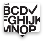
Few designers know how to create a check mark which will look good with typography, icons and user interface. Most professional fonts do not have check marks, and when they do — they are just awful: |
||||||||

Arial
Lucida Grande
Minion
Capitals
Meyrio
Centro Slab
|
||||||
|
To make things right, the bureau designed good check marks – or galochki [ˈgɑːloʧkɪ] in Russian – for popular fonts: |
||||||||
|
|
||||||
Check marks in EPSCheck marks are free for any purposes if you send us a link, a photo or a screenshot of how you use them (galochki@artgorbunov.ru). |
The bureau designed check marks for the fonts that do not have ones of their own. We call for font designers to create check marks for all families and faces they design. Unicode symbols2713Check mark2714Heavy check mark2611Ballot box with checkWith empty Ballot box 2610 Good to know
When placing a check mark inside a geometric form, consider that the optical center of the symbol is not in the middle, but on the vertical of the bottom Vote for
To make the check mark stand out in text, make it bigger than the letter case Check mark in next to a line of text should go a little below the baseline |
||||||
Usage |
||||||||
|
In user interface: |
||||||
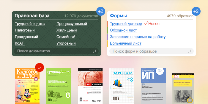
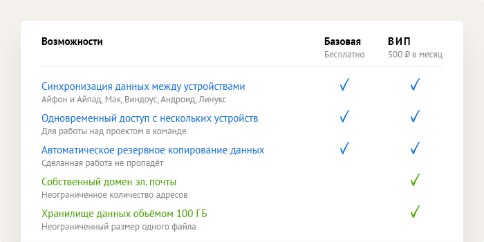
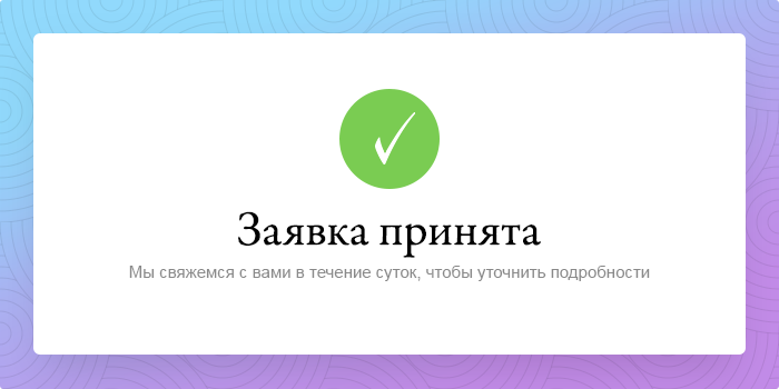
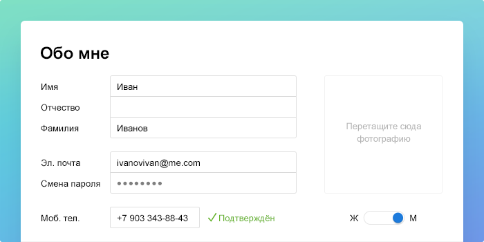
Indicator
Table
Message
Form
|
||||||
|
In text: |
||||||
|
Symbol
|
||||||
About the projectArt directed by Artem Gorbunov Led and designed by Michael Nozik Type designed by Ksenia Belobrova Tweet
Share
Send
|

Bin |
||||
| © 2026 Artem Gorbunov Design Bureau |
Drop us a line: mail@artgorbunov.ru +7 495646-84-89 |