EN
|
EN |
||||||||
Park Reader’s Identity
11th October 2010
|
|
||||
|
The bureau developed the service’s identity. The logo illustrates reading in the four (or more) corners of the earth: |
|||||||
|
|
|
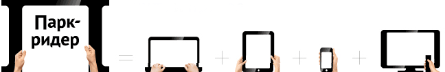
Once purchased, the newspapers, magazines and books are available on iPhone, iPad, Android and E-Ink devices, under Mac OS, Windows and even on Net-TV: |
|||||||
|
|
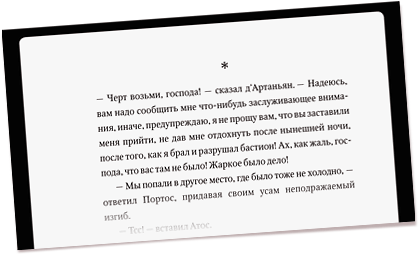
Park Reader recommends wisely and helps its users socialize. Park Reader’s logo is the first logo made in first-person: |
|||||||

|
|
The male card features strong hands, the female one comes with a pair of elegant ones
|
|||||||
|
A captivating story on every business card
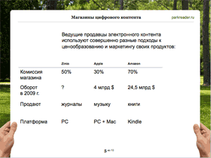
The Park Reader team is often seen talking to their partners about the advantages of the service. On-screen presentations help them do that: |
|||||||

with first-person approach,
clean and noiseless tables,
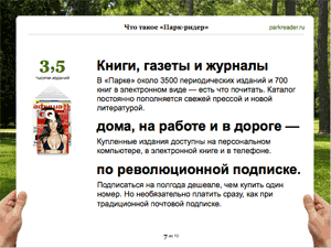
coherent headlines and to-the-point factoids.
|
|||||
About the projectType designed by Zahar Yashchin Designed by Valeriy Popov, Eugene Arutyunov Edited by Maxim Ilyakhov |


Bin |
||||||
| © 2010 Artem Gorbunov Design Bureau |
Drop us a line: mail@artgorbunov.ru | |||||||